Articles & Videos
Finding the perfect font for Sound Waves Decodable Readers
Categories
![]()
Subscribe to our newsletters
Receive teaching resources and tips, exclusive special offers, useful product information and more!
Back to Product Features articles & videos
Finding the perfect font for Sound Waves Decodable Readers
Sound Waves 24/5/23
Please note: A new and improved Sound Waves Years 3–6 program is on its way for use in 2027! Information in our professional learning articles may differ in the updated edition.
Finding a font that had everything for the Sound Waves Decodable Readers was like finding a needle in a haystack. Our authors sifted through nearly 1,400 different fonts before they found the right one for the job.
What exactly were they looking for? Let’s unpack it!
Easily distinguishable letters
Unsurprisingly, one of the most important criteria for the perfect font was one which had easily recognisable, unique characters. For example, a clear open e and c were important to avoid those letters looking like an o. Also, long ascenders and descenders on letters like f, g and j to really exaggerate the character differences.
Easily recognisable punctuation
While some fonts have simplified apostrophes, speech marks and commas, our authors opted for a font with curved apostrophes and clear full stops, in addition to exclamation marks and question marks that students can easily identify.
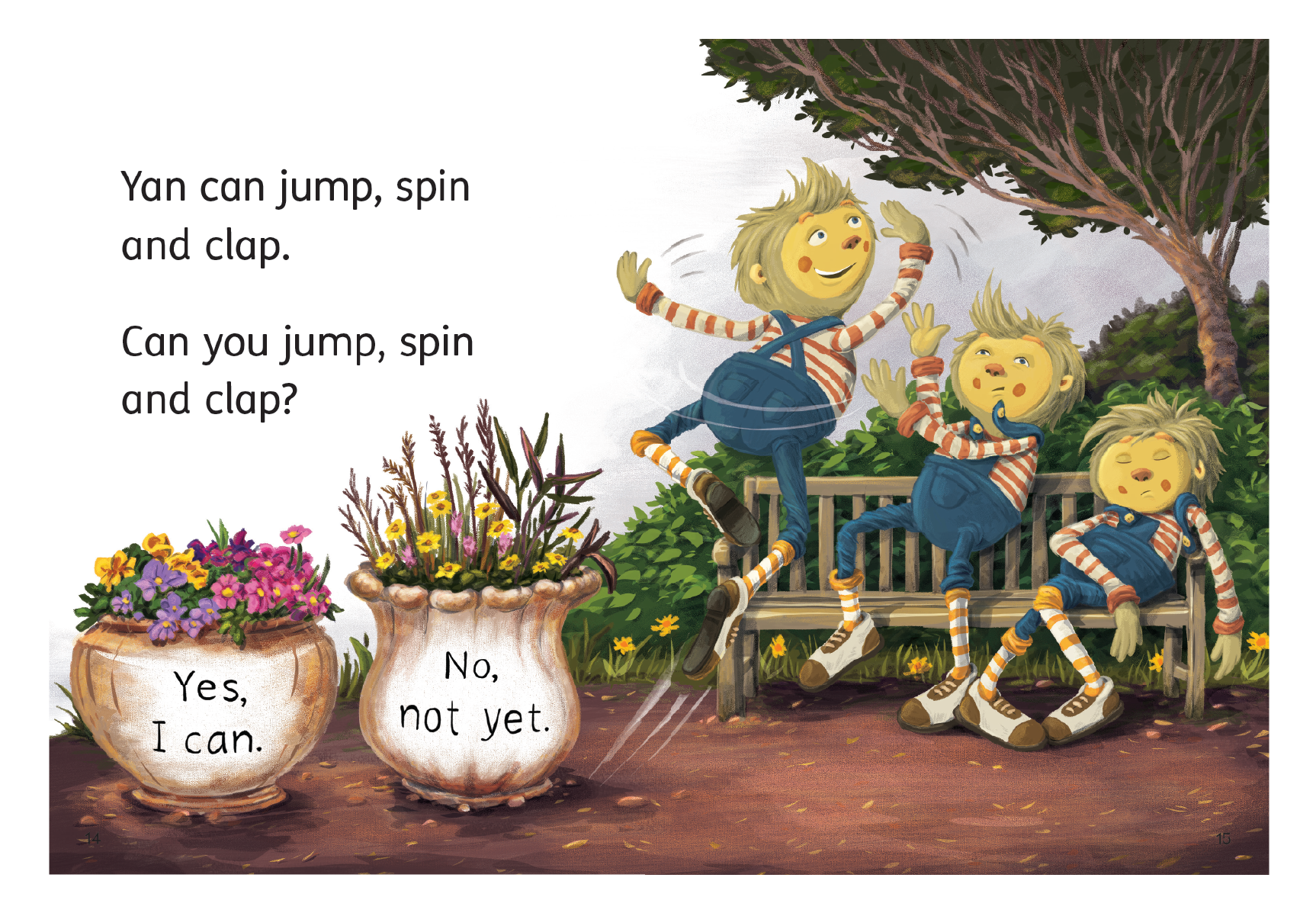 Sound Waves Foundation Decodable Reader ‘Yan Can. Can You?’ (Extended)
Appropriate spacing between letters
When some letters are tightly placed next to one another, they can start to look like other letters. For example, squishing rn together in fern can look like an m, causing the word to be read as fem. Having a font with generous spacing between the characters helps avoid confusion for beginning readers.
A recognisable l, i and number 1
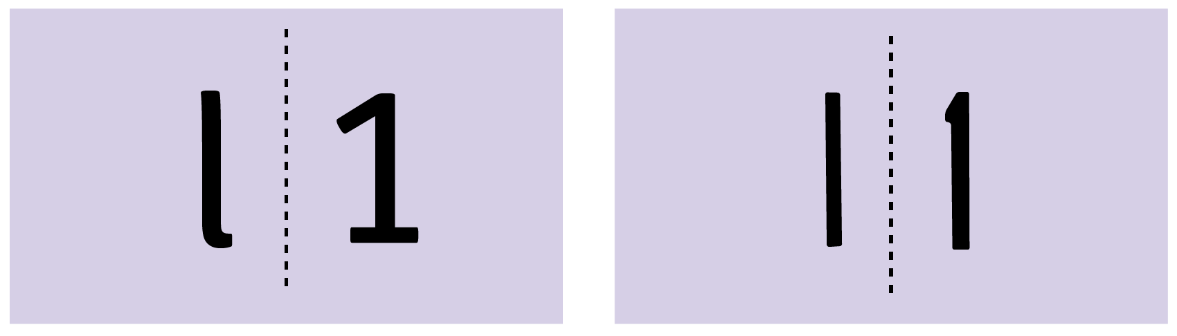
FS Me (left) Hooligan (right)
A common issue with fonts is that lower case l, capital I and number 1 can all look the same, so the authors needed a font which had a line at the top and bottom of the capital I to help avoid confusion.
A single storey ‘a’
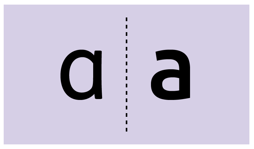
While students will eventually need to recognise the double storey ‘a’, the Sound Waves Decodable Readers’ authors wanted to make grapheme recognition as easy as possible for beginning readers, which meant using the single storey a. This matches the version children are most commonly taught to write.
No mirroring!
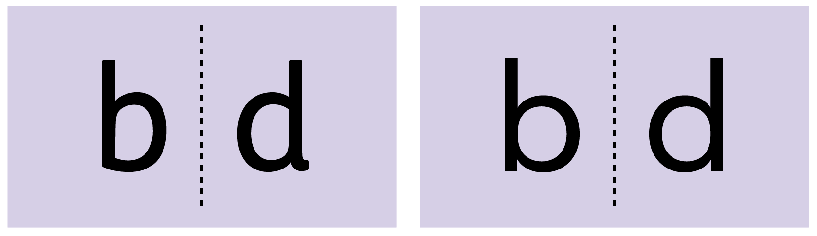
FS Me (left) Celias (right)
Distinguishing between certain letters can be tricky for students, for example p and q, or b and d. The authors wanted to avoid using a font that simply mirrored these letters and compounded the issue. In the Sound Waves Decodable Readers, these letters are all distinct from each other, which helps students identify them more easily.
A considered design
Our authors know these Decodable Readers are a resource students will likely look at every single day. Many fonts for children are messy or outdated and don’t reflect the importance of the reading resource. So, the authors made sure they chose a clean, clear and visually appealing font.
In the end, the authors selected the font: FS Me.
This font is characterised by its considered, accessible, friendly and legible design.
It was developed in conjunction with the charity Mencap – a leading UK charity for people with learning disabilities, who sought to create a font which exceeded the recommendations of government accessibility guidelines. A lovely cherry on top for our Sound Waves Decodable Readers’ authors!
If you want to learn more about the Decodable Readers, head to our website to view sample pages, see how the program is structured or speak with an education consultant.